This article covers what CSS is, how to attach it to your HTML, the basic rules of how CSS is written, and the core properties and selectors you need to start styling your own pages.
For the basics of HTML, the first article "What is HTML?" walks through what HTML is, how tags work, and how to build a simple web page from scratch. You can also try out headings, paragraphs, links, images, and lists in the live previews there.
The second article "HTML Structure and Semantics" goes deeper into HTML concepts like block vs inline elements, whitespace handling, text semantics, and the structural elements that give a page its shape. If you want to learn about HTML as well, check that one out too.
What Does CSS Stand For?
CSS stands for Cascading Style Sheets. Let's break that down.
Style Sheets
A style sheet is a list of rules that describe how something should look.
In CSS, each rule says something like
"make all <h2> elements red and 24 pixels,"
or "give every paragraph a bit of space around it."
For example, you can define a rule like this:
<!DOCTYPE html>
<html>
  <head>
    <style>
      h2 {
        color: blue;
        font-size: 24px;
        font-weight: bold;
      }
    </style>
  </head>
  <body>
    <h2>This is a heading</h2>
  </body>
</html>
In the example above, the <style>...</style> block is the style sheet.
It defines a CSS rule that says: make every <h2> element blue,
set the font size to 24 pixels, and make the text bold.
(The other HTML tags are kept minimal here to focus on the CSS.)
HTML focuses on meaning: this is a heading, this is a paragraph, this is a link. CSS focuses on presentation: how big the heading is, what color the paragraph text is, whether the link is underlined or not. This separation is one of the most important ideas in modern web development. You can completely change the look of a site just by swapping out the CSS, without touching the HTML at all.
Cascading
The "Cascading" part is what makes CSS unique.
Simply put, multiple style rules can apply to the same element at the same time -
some from your own stylesheet, some from the browser's default styles,
and sometimes even from a user's personal preferences.
When rules conflict, CSS has a clear priority system that decides which one overrides the others.
For example, you could add a second rule that also targets the same <h2> as the one above:
h2 {
  color: blue;
  font-size: 24px;
  font-weight: bold;
}

h2 {
  color: red; /* Change the text color to red */
  background-color: aqua; /* Add an aqua background */
}
The first rule is the same one from our earlier
style sheet example.
The second rule targets the same <h2> with different values,
so when the two rules set the same property (here, color),
the cascade decides which value wins.
This priority system is called the cascade, and it's where the "C" in CSS comes from. This article will only touch on it lightly - the cascade is a deep topic that deserves its own write-up later. For now, just keep in mind that CSS is designed to combine styles from multiple sources, not just pick one and ignore the rest.
Note:
Before CSS existed, most websites styled web pages by sprinkling presentation tags like
<font>, <center>, and <b>
directly into their HTML.
It worked, but it mixed structure and appearance together,
so changing the look of a site meant editing every single page by hand.
CSS was first proposed in 1994 and became an official standard in 1996,
specifically to solve this problem -
by moving all the styling into a separate layer that any number of HTML pages could share.
How CSS and HTML Work Together
When a browser loads a web page, it does roughly this:
- Read the HTML and build the structure of the document (the DOM).
- Read all the CSS that applies to the page and figure out which rules apply to which elements.
- Combine the two to draw the final page on screen.
As we mentioned in the previous article, think of a web page like a house: HTML is the frame and walls, CSS is the paint and furniture, and JavaScript is the wiring and appliances (we'll cover JavaScript in a later article). CSS handles the "paint and furniture" side of things: text colors, fonts, layouts, background images, and everything else visual.
In other words, CSS doesn't replace HTML - it sits on top of it. Every rule you write in CSS targets an HTML element (or a group of them) and changes how that element is displayed. No HTML, no CSS to apply.
Three Ways to Add CSS to a Page
There are three different ways to attach CSS to your HTML. All three work, but each has its own use case.
1. Inline Styles (the style attribute)
The simplest way is to add a style attribute directly on an HTML element.
You actually saw this back in the
previous article,
where we used it to give boxes a background color.
<p style="color: red; font-size: 20px;">This text is red and 20 pixels.</p>
Inline styles are quick and easy for one-off tweaks,
but they're not great in the long run.
If you want to make every paragraph on your site red,
you'd have to add the same style attribute to every single <p>.
And if you ever want to change red to blue, you have to edit every one of them.
When the same style needs to apply to multiple elements,
the <style> tag or an external stylesheet (covered below) will save you a lot of time.
2. Internal Styles (the <style> tag)
The next step up is putting your CSS inside a <style> tag,
usually placed in the <head> of the document.
All the rules inside it apply to the current page.
<!DOCTYPE html>
<html>
  <head>
    <style>
      p {
        color: red;
        font-size: 20px;
      }
    </style>
  </head>
  <body>
    <p>This paragraph is red.</p>
    <p>So is this one.</p>
  </body>
</html>
Unlike inline styles (which only affect one specific element),
a single rule inside a <style> tag applies to every matching element on the page.
That means less to write, and it's easier to see all your styles in one place.
Internal styles work well for small, single-page experiments.
But if you have a whole site with many pages, you'd still have to copy the same
<style> block into every file.
3. External Stylesheets (the <link> tag)
As your styles grow, the most common approach in practice is to put your CSS in a separate file
with a .css extension, and link to it from your HTML.
First, create a file called something like style.css:
p {
  color: red;
  font-size: 20px;
}
Then link it from the <head> of your HTML:
<!DOCTYPE html>
<html>
  <head>
    <link rel="stylesheet" href="style.css">
  </head>
  <body>
    <p>This paragraph is red.</p>
  </body>
</html>
The <link> tag tells the browser to load style.css
and apply its rules to the page.
The rel="stylesheet" part says "this linked file is a stylesheet."
This approach has two big advantages:
- Reusability - One CSS file can be linked from any number of HTML pages. Change the file once, and every page that links to it updates instantly.
- Separation of concerns - Your HTML stays focused on structure, and your CSS stays focused on appearance. The two don't get tangled up with each other.
Throughout the rest of this article, we'll write CSS as if it were in an external stylesheet, but the syntax is the same wherever you put it.
Tip:
The <link> tag is a void element (no closing tag),
just like <img> and <br>.
It's also worth noting that you can include multiple <link> tags
to load several stylesheets at once.
The Anatomy of a CSS Rule
Here's what a CSS rule looks like:
h1 {
  color: red;
  font-size: 32px;
}
This rule says: "for every <h1> element on the page,
set the text color to red and the font size to 32 pixels."
Here's what each part of the rule is called:
- Selector -
h1. This is what the rule applies to. - Declaration block - everything between the curly braces
{ ... }. - Declaration - one line like
color: red;. A declaration sets a single property. - Property -
color. The thing you're changing. - Value -
red. What you're changing it to.
A rule must have one selector and at least one declaration, but it can have as many declarations as you like. Each declaration follows the same pattern:
property: value;
The colon (:) separates the property from the value,
and the semicolon (;) marks the end of the declaration.
Tip:
Technically, the semicolon after the last declaration in a block is optional -
color: red works just as well as color: red; at the end.
But it's a strong convention to always include it,
so that adding a new line later doesn't accidentally break the rule.
The selector is the part that decides which elements get the styles.
In this case, h1 targets every <h1> element on the page.
No other elements are affected -
paragraphs, links, and headings of other levels are left alone.
Different properties accept different kinds of values.
color accepts a color (like red or #ff0000),
font-size accepts a size (like 32px or 1.5em),
and so on.
We'll cover the most common properties and the values they accept in a moment.
Multiple Rules, Multiple Declarations
A stylesheet can have many rules, one after another. Each rule targets a different element (or group of elements):
h1 {
  color: red;
  font-size: 32px;
}

p {
  color: #333;
  line-height: 1.6;
}

a {
  color: blue;
  text-decoration: underline;
}
CSS syntax doesn't care about whitespace. You can put each declaration on its own line, or cram them all on one line. Both of these mean exactly the same thing:
/* Multi-line (easier to read) */
h1 {
  color: red;
  font-size: 32px;
}

/* Single-line (more compact) */
h1 { color: red; font-size: 32px; }
Multi-line is more common in practice - it's easier to add or remove declarations later, and easier to skim through a long stylesheet.
Comments in CSS
You can leave notes in your CSS that the browser will ignore.
Comments in CSS are written between /* and */,
and they can span any number of lines:
/* This is a single-line comment. */

/*
  This is a multi-line comment.
  Useful for explaining a section of styles
  or temporarily disabling rules.
*/

p {
  color: red; /* You can also put comments at the end of a line */
}
Note that CSS does not support the // single-line comment style
that JavaScript and many other languages use.
Always use /* ... */ in CSS files.
You can write anything inside a comment as long as it doesn't contain */
(which would end the comment early).
Comments are useful for grouping related rules,
leaving notes for your future self,
or quickly disabling a rule while you're testing something out.
p {
  color: red;
  /* font-size: 20px; */  /* temporarily disabled */
}
Common Properties
CSS has hundreds of properties, but in practice you'll only use a few dozen most of the time. Let's go through the ones you'll reach for again and again.
Text and Font Properties
| Property | Description |
|---|---|
color |
Sets the color of the text. |
font-size |
Controls how large the text is. |
font-weight |
Determines how bold the text is. Common values: normal, bold, or a number from 100 to 900. |
font-family |
Specifies which font to use, like Arial or "Helvetica Neue". |
font-style |
Controls whether the text is normal or italic. Values: normal or italic. |
text-align |
Sets the horizontal alignment of the text: left, center, right, or justify. |
text-decoration |
Controls underlines and strikethroughs: none, underline, line-through. |
line-height |
Sets the height of each line of text. A value of 1.5 means "1.5 times the font size." |
<style>
h1 {
  color: #2a6df4;
  font-size: 28px;
  font-weight: bold;
  text-align: center;
}

p {
  color: #398ece;
  font-size: 16px;
  font-family: Arial, sans-serif;
  line-height: 1.6;
}
</style>

<h1>A Centered Heading</h1>
<p>A paragraph styled with custom color, size, font, and line height.</p>
Background Properties
background-color- a flat background color behind the element.background-image- sets an image as the background, likeurl("photo.jpg").background-repeat- whether a background image tiles or not.background-position- where the background image is anchored.
<style>
  div {
    background-color: #fcf0c1;
    color: #333;
  }
</style>

<div>A box with a soft yellow background.</div>
List Properties
Lists have their own set of properties that control how the bullets or numbers look.
list-style-type- the marker style. For unordered lists:disc(default),circle,square,none. For ordered lists:decimal(default),lower-alpha,upper-roman, etc.list-style-position-outside(default) orinside.
<style>
  ul {
    list-style-type: square; /* Display square markers */
  }
</style>

<ul>
  <li>HTML</li>
  <li>CSS</li>
  <li>JavaScript</li>
</ul>
State-Based Styling: Pseudo-Classes
Sometimes you want to style an element only when it's in a particular state - for example, when the user hovers over a link, or when a link has already been visited. CSS does this with pseudo-classes: special keywords that you attach to a selector with a colon.
Links are the classic example:
<style>
/* an unvisited link */
a:link {
  color: blue;
}

/* a link the user has already visited */
a:visited {
  color: purple;
}

/* while the mouse is over the link */
a:hover {
  color: red;
  text-decoration: underline;
}

/* the moment the link is being clicked */
a:active {
  color: orange;
}
</style>

<a href="https://example.com/">Example Link</a>
Pseudo-classes aren't limited to links. A few more useful ones:
| Selector | Description |
|---|---|
:hover |
When the mouse pointer is over the element. Works on any element, not just links. |
:focus |
When the element is focused (like an input field that's currently being typed in). |
:first-child / :last-child |
The first or last child inside its parent. |
:nth-child(n) |
Target a specific child by position. li:nth-child(odd) picks every other list item. |
Note:
The order of :link, :visited, :hover, and :active matters.
They overlap with each other, and because of how the cascade works,
a later rule can override an earlier one.
The conventional order is Link, Visited, Hover, Active
(sometimes remembered as "LoVe HAte").
Get the order wrong and your hover styles might silently stop working on visited links.
Specifying Colors
As you've seen in the examples above, CSS gives you several different formats for specifying a color. They all produce a color, but each has its own strengths.
Named Colors
CSS comes with about 140 predefined color names that you can use directly:
red, blue, green, black, white,
gray, tomato, steelblue, rebeccapurple, and many more.
h1 { color: tomato; }
p  { color: dimgray; }
Named colors are easy to read, but the palette is fixed - you can only choose from the names CSS already knows about. For anything more specific, you'll want one of the formats below.
Hex Codes
Hex codes start with a # and use six hexadecimal digits to specify
the amount of red, green, and blue in the color.
Two digits each, in the order R, G, B.
h1 {
  /* pure red. Red=255(0xff), Green=0, Blue=0 */
  color: #ff0000;
}

p  {
  /* dark gray. Red=Green=Blue=51(0x33) */
  color: #333333;
}

div {
  /* cornsilk. Red=255(0xff), Green=248(0xf8), Blue=220(0xdc) */
  background-color: #fff8dc;
}
When all three pairs use the same digit twice (like #ff0000 or #333333),
you can use a shorter three-digit form:
#f00 is the same as #ff0000,
and #333 is the same as #333333.
RGB and RGBA
rgb() lets you write colors as three numbers from 0 to 255.
rgba() adds a fourth value for opacity (0 = fully transparent, 1 = fully opaque).
h1 {
  color: rgb(255, 0, 0); /* same as #ff0000 */
}

div {
  background-color: rgba(0, 0, 0, 0.5); /* black at 50% opacity */
}

p {
  /* rgb() also supports a syntax with a slash for alpha */
  background-color: rgb(0 0 0 / 20%);
}
RGBA is especially useful when you want a tinted overlay or a translucent panel.
HSL and HSLA
hsl() stands for Hue, Saturation, Lightness.
Hue is an angle on the color wheel (0-360),
saturation and lightness are percentages.
Many designers find this easier to think about than RGB,
because adjusting "lightness" or "saturation" feels more intuitive than tweaking red and green channels.
h1 { color: hsl(0, 100%, 50%); }    /* pure red */
p  { color: hsl(210, 50%, 30%); }   /* a muted dark blue */
Tip: There's no "right" format - they all produce colors, and modern browsers accept all of them interchangeably. Hex is the most compact and widely seen in real codebases. RGB/HSL are handy when you need transparency. Named colors are great for quick prototypes. Pick whatever feels comfortable.
Units: How to Specify Sizes
Many CSS properties expect a size value -
things like font-size, width, margin, and padding.
CSS supports many different units for these sizes,
and they fall into two broad categories: absolute and relative.
Absolute Units
Absolute units are fixed sizes that don't change based on context.
By far the most common is px (pixels).
| Unit | Description |
|---|---|
px |
Pixels. The most common unit. 16px is a typical body text size. |
pt, cm, mm, in |
Mostly used for print styles. |
h1 {
  font-size: 32px;
}
Relative Units
Relative units are sized relative to something else -
the parent element, the root element, or the size of the browser window.
(The "root element" in an HTML document is the topmost element -
the <html> element itself.)
This is what makes layouts adapt to different screens.
| Unit | Description |
|---|---|
% |
A percentage of the parent's value. width: 50% means "half the width of my parent." |
em |
Relative to the current element's font-size. If the font size is 16px, then 2em equals 32px. |
rem |
Relative to the root element's font size (the <html> element). Unlike em, it doesn't compound when nested, which makes it more predictable. |
vw / vh |
Viewport width and height. 50vw means "half the width of the browser window." |
h1 {
  font-size: 2rem; /* twice the root font size */
}

.box {
  width: 50%; /* half the parent's width */
  height: 100vh; /* the full height of the viewport */
}
Note:
When you're starting out, px is perfectly fine for almost everything.
As your designs become more responsive (adapting to phones, tablets, and desktops),
you'll find yourself reaching for rem, %, and vw/vh more often.
Don't worry about picking the "right" unit on day one - just be consistent within a project.
The Box Model: Margin and Padding
Every element on a web page is treated as a rectangular box. Even a single word inside a paragraph has a box around it. This is called the CSS box model, and it's one of the most fundamental concepts in CSS.
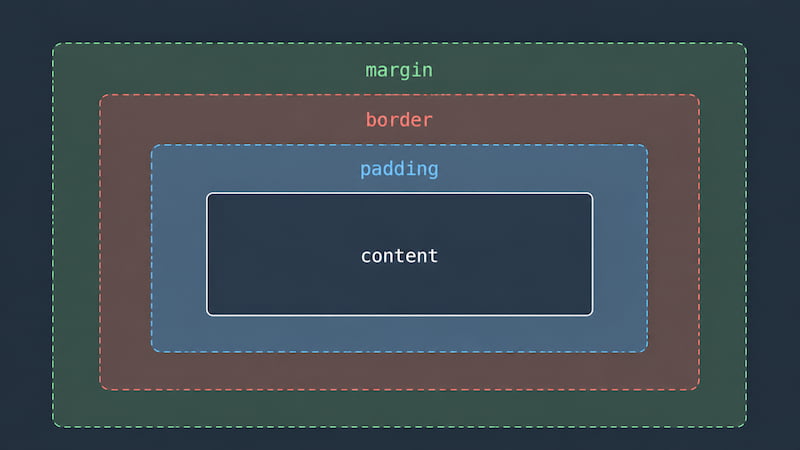
Each box is made up of four layers, working from the inside out:
- Content - the actual text or image inside the element.
- Padding - space inside the box, between the content and the border.
- Border - a line drawn around the padding.
- Margin - space outside the box, separating it from other elements.
<style>
  div {
    background-color: #b9e1ff;
    padding: 16px; /* space inside */
    border: 2px solid #2a6df4;
    margin: 24px; /* space outside */
  }
</style>

<div>A box with padding inside and margin outside.</div>
A common point of confusion: padding is inside, margin is outside.
If you want to push your text away from the edge of its colored box, use padding.
If you want to push the whole box away from its neighbors, use margin.
Setting Each Side Separately
You can set the top, right, bottom, and left independently using the suffixed properties:
div {
  margin-top: 10px;
  margin-right: 20px;
  margin-bottom: 10px;
  margin-left: 20px;
}
Or you can use the shorthand margin property and write them on one line.
CSS interprets the values clockwise, starting from the top:
/* All four sides: top, right, bottom, left = 10px */
div { margin: 10px; }

/* Vertical, horizontal: top/bottom = 10px, left/right = 20px */
div { margin: 10px 20px; }

/* Top, horizontal, bottom: top = 10, sides = 20, bottom = 30 */
div { margin: 10px 20px 30px; }

/* Top, right, bottom, left */
div { margin: 10px 20px 30px 40px; }
The same shorthand pattern works for padding too.
Tip: Open your browser's developer tools (right-click any element → "Inspect"), and you'll see the box model rendered visually for whatever element is selected. It's a fantastic way to understand how padding, border, and margin actually look in practice - you can hover over each layer and the browser highlights it on the page.
Putting It All Together
Here's a complete page using several of the things we've covered in one place:
<!DOCTYPE html>
<html>
  <head>
    <style>
      body {
        font-family: Arial, sans-serif;
        line-height: 1.6;
        background-color: #f0f0f0;
        color: #333;
      }

      h1 {
        color: #2a6df4;
        text-align: center;
        margin-top: 40px;
      }

      p {
        margin: 40px;
        padding: 16px;
        background-color: #fff8dc;
        border: 1px solid #ccc;
      }
    </style>
  </head>
  <body>
    <h1>CSS - Style Sheets</h1>
    <p>
      This is a simple page styled with CSS.
      The heading is centered and blue, while the paragraph has a soft yellow background and some padding.
      The body has a light gray background and uses a clean sans-serif font.
    </p>
  </body>
</html>
Summary
- CSS stands for Cascading Style Sheets. It controls how HTML elements look on screen.
- You can add CSS three ways: inline (the
styleattribute), internal (a<style>tag in the<head>), or external (a separate.cssfile linked with<link>). Each has its place depending on the situation. - A CSS rule is a selector followed by a declaration block. Each declaration is a
property: value;pair. - CSS comments are written with
/* ... */. The//style used in JavaScript does not work in CSS. - Common properties include
color,font-size,font-weight,font-family,background-color,text-align, andline-height. - Colors can be written as named colors (
red), hex codes (#ff0000), or function forms likergb(),rgba(), andhsl(). - Sizes use units. Absolute units like
pxare fixed; relative units like%,em,rem, andvw/vhadapt to context. - The box model treats every element as a box with four layers: content, padding (inside), border, and margin (outside).
What's Next
In this article, we selected elements using tag names like p, h1, and div.
That works, but it applies the style to every element with that tag on the page.
The next article covers CSS selectors (class selectors, ID selectors, and more),
so you can target exactly the elements you want.
Try It Yourself
The fastest way to get a feel for CSS is to start tweaking things and see what happens. Open the SyncFiddle Editor, write a small HTML page, and try changing colors, font sizes, padding, and margins. CSS is one of those things that clicks once you've actually played with it for a few minutes.